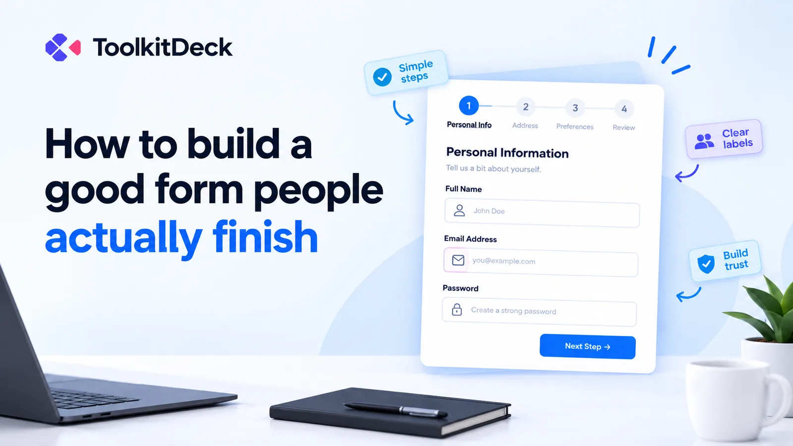
How to build forms people actually finish
Registration forms, surveys, applications and order forms lose people at every unnecessary question. How to design a form that gets completed, especially on a phone, with examples you can copy.

Edema Ukabi, ToolkitDeck Team
· 5 min read
Key points
- Every question you add loses some people. Ask only what you will actually use.
- Most people will open your form on a phone, so design for a small screen first.
- Use the right kind of question so phones show the right keyboard, and prefer taps to typing.
- Show a question only when it applies, such as a delivery address only for delivery.
- Split long forms into short pages, and put the easy questions first.
- Tell people exactly what happens after they press send.
A form is a structured document or interface used to collect information from someone. Beyond this, a form is a request for someone's time. The more questions it asks, the more people give up halfway, and you never hear from them again. Studies of form completion consistently find that every extra field costs some people, and that the effect is stronger on phones.
The good news is that a few deliberate choices make a big difference. This guide covers how to decide what to ask, how to design for phones, how to keep long forms manageable and how to end a form well, with examples you can copy.
How many questions should a form have?
As few as you can. Before you add a question, ask yourself: what will I do with the answer? If the honest answer is "nothing yet", leave it out. You can always ask later, once someone has signed up, bought something or turned up.
A useful test is to read your form out loud, as if you were asking a customer face to face. Questions that feel awkward to say tend to feel awkward to answer.
Before and after: an event registration
A first draft often looks like this:
Title, first name, middle name, last name
Date of birth
Gender
Home address
Email and phone
Job title and company
How did you hear about us?
Dietary requirements
Any other comments
For a free evening event, most of that isn't needed. A better version:
Full name
Email
Phone (optional, for a reminder on the day)
Dietary requirements (only shown if they say they are staying for dinner)
Four short questions instead of twelve, and nothing important is lost.
How do you design a form for phones?
Most people open forms from a link on WhatsApp, a social media post or a QR code on a poster, which means most of them are on a phone. On a small screen:
Use one column. Fields side by side are hard to read and tap on a phone.
Use the right type of question. A phone number field brings up the number pad, an email field brings up the @ key, and a date field opens a calendar.
Prefer tapping to typing. "Yes / No" buttons, a list to choose from or a star rating are all quicker than typing.
Keep labels short and clear. "Your phone number" beats "Please provide a contact telephone number at which you can be reached".
Make buttons big enough to tap with a thumb.
How do you keep long forms manageable?
Some forms really do need a lot of information: a school application, a job application, a membership form. Three techniques help.
Show questions only when they apply
Nothing makes a form feel longer than questions that don't apply to you. Use conditional questions, sometimes called logic, so that:
the delivery address appears only for people who choose delivery
"Why not?" appears only for people who answer no
business questions appear only for people who say they are a business
Each person sees a shorter form, and you still get every answer you need.
Split it into pages
Break a long form into short pages, each with a heading: "About you", "About your child", "Documents". A page with four questions feels manageable. One screen with forty doesn't. A progress indicator, such as "Step 2 of 4", tells people the end is in sight.
Put the easy questions first
Start with questions people can answer without thinking, like their name. Once someone has answered a few, they are much more likely to carry on to the harder ones.
How should you handle payments on a form?
A form is a good way to collect an order or a registration. Payment is usually a separate step, so say how it works on the form itself: "We'll confirm your order on WhatsApp and send you our account details." That way nobody is surprised, and nobody types card details into a form that wasn't built for them.
What should happen after someone presses send?
Tell them, clearly:
What happens next: "We'll reply within two working days."
What they will receive: "Check your email for your confirmation."
What to do if something is wrong: "Made a mistake? Reply to the confirmation email."
A form that ends in silence leaves people wondering whether it worked, and some will fill it in twice.
How do you get people to fill in your form?
A form only works if people see it. Share it where your audience already is:
send the link on WhatsApp and in your social media posts
print the QR code on posters, flyers, receipts and table cards
put the form on your website
add it to your email signature
If places are limited, close the form automatically on a date or after a number of responses, so nobody signs up for something that is already full.
Common questions
Should every question be required?
No. Make a question required only if you can't act without the answer. Too many required questions is one of the most common reasons people abandon a form.
Is a long form ever better?
Sometimes. A detailed form can filter out people who aren't serious, such as for a job or a high-value quote. Even then, split it into pages and explain why you need each part.
How do I stop spam?
Close the form when you have enough responses, avoid posting the link in places that attract bots, and review responses before acting on them. Many form tools also filter obvious spam automatically.
Can I see the answers as a spreadsheet?
With most form builders, yes. Answers arrive in a table you can search, filter and download for Excel.
What makes a good survey question?
Ask about one thing at a time, avoid leading wording ("How much did you love…?"), and give a balanced scale. A single 0 to 10 "How likely are you to recommend us?" question is easy to answer and easy to track over time.
Build your form
ToolkitDeck's form builder starts from a template or a blank page, shows questions only when they apply, splits long forms into pages and works well on any phone, with nobody needing an account to answer. Share it as a link, a QR code or a form on your website, and every answer lands in a table you can search and download.
Taking appointments rather than registrations? Read how to set up online booking with fewer no-shows.